Form Builder module takes users and app interaction to a new level. The module makes it possible for users to engage and express themselves.
In some way Form Builder, it's a kind of reaction source which, with the help of different polling methods makes it possible for you to understand users' thoughts and feelings about your collection or museum experience.
Form builder it's a constructor which allows you to create a form suitable to any idea or purpose. By selecting different components and organizing them in a necessary way you can create a form that meets your exact goal.
Form builder contains several components which can be selected an unlimited number of times and arranged in any order.

Here is the list of components and their settings available in the Form Builder
Text
The component is used for adding content to the Form.
Component Label
Here you can add the component title. The title displays only on the component card in the CMS to differentiate one component from another.
Text to display
Add text that will be displayed at this component in the module.

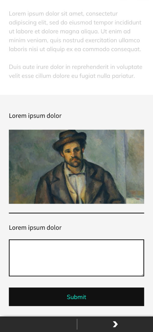
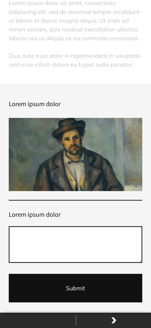
Image
Component allows adding images to the Form builder.
Component Label
Here you can add the component title. The title displays only on the component card in the CMS to differentiate one component from another.
Image
Upload or select an image from the gallery that will be shown in the Form Builder.

Image container height
Set the image height here. Height can be set in px or em.

Image display option
Contain option makes the Image display inside the form builder and in this case image does not expand to the size of the container unlike if the Cover option is selected.


Image align
Here you can align the Image inside the form builder container. You can display it on the left, right sides, or in the center of the container.

Divider
Allows setting a dividing line between the Form components in the live form in the app.

Component Label
Here you can add the component title. The title displays only on the component card in the CMS to differentiate one component from another.
Padding on top
Set the top indentation between divider line and component above the line.

Padding on bottom
Set the bottom indentation between divider line and component under the line.

Line thickness
Here you can set the thickness of the dividing line.

Line Color
Set the color of the dividing line.

Dropdown
Makes it possible to add questions/quizzes with a predefined set of answers displayed in the dropdown. There are no limits in the number of options displayed in the dropdown. Component limits the choice of options to one.
Component Label
Here you can add the component title. The title displays only on the component card in the CMS to differentiate one component from another.
Display Label
Add and style label that will be displayed in the app.

Required
Check the box if you want to make submission of this component mandatory for Submitting the form in the app. That is if the option is set app user will not be able to submit the whole form without selecting an option in this section.
Options
Here you can add options that will be displayed in the dropdown. Click +/- to add additional options to the dropdown or remove ones.

Dropdown text styling
Here you can style options text in the dropdown.

Dropdown rounded corners
Set the radius of corners in the dropdown.

Dropdown background-color
Set the background color of the dropdown.

Dropdown stroke color
Set the color of the dropdown field border.

Dropdown icon color
Set the dropdown icon color.
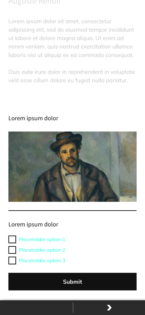
Checkbox
The component is also used to provide users with some predefined options for an answer. Its difference from the Dropdown is that it allows users to select multiple options for the answer.
Component Label
Here you can add the component title. The title displays only on the component card in the CMS to differentiate one component from another.
Display Label
Add and style labels that will be displayed in this component in the app.

Required
Check the box if you want to make submission of this component mandatory for Submitting the form in the app. That is if the option is set app user will not be able to submit the whole form without selecting an option in this section.
Options
Here you can add options that will be displayed in the checkboxes. Click +/- to add additional options to the checkbox or remove ones.
Checkboxes text styling
Here you can style the text of the checkboxes.
Checkboxes rounded corners
Set the checkboxes corner radius.

Checkboxes unselected color
Set the color of a checkbox when it is not clicked/selected.

Checkboxes selected color
Set the color of a checkbox when it is clicked/selected.

Checkboxes icon color
Set the color of the icon inside the checkbox. The icon displays when the checkbox is clicked.
Multiple Choice
Has the same functionality as the Dropdown component but in a way of radio buttons. The options choice is also limited to one.
Component Label
Here you can add the component title. The title displays only on the component card in the CMS to differentiate one component from another.
Display Label
Add and style labels that will be displayed in this component in the app.

Required
Check the box if you want to make submission of this component mandatory for Submitting the form in the app. That is if the option is set app user will not be able to submit the whole form without selecting an option in this section.
Options
Here you can add options that will be displayed in the Multiple Choice list. Click +/- to add additional options to the Multiple Choice or remove ones.
Multiple Choice text styling
Here you can style options of the Multiple choice.

Multiple Choice rounded corners
Set the Multiple Choice boxes corners radius.

Multiple Choice unselected color
Set the color of a Multiple Choice box when it is not clicked/selected.

Checkboxes selected color
Set the color of a checkbox when it is clicked/selected.

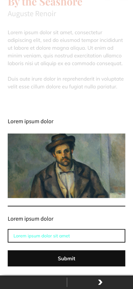
Text Input
Is used for collecting users' emails or numeric data if validation is set. Otherwise, if validation is not set can be used for gathering short text data.
Component Label
Here you can add the component title. The title displays only on the component card in the CMS to differentiate one component from another.
Display Label
Add and style labels that will be displayed in this component in the app.

Required
Check the box if you want to make submission of this component mandatory for Submitting the form in the app. That is if the option is set app user will not be able to submit the whole form without selecting an option in this section.
Validation
Data entered into the Text Input will be checked to be either an email or numeric value depending on which of the options is selected.

Text Input text styling
Users' input will be of the same style as set in this field.
Text Input rounded corners
Set the radius of corners in the Text Input field.

Text Input background-color
Set the background color of the Text Input field.

Text Input stroke color
Set the color of the Text Input field border.

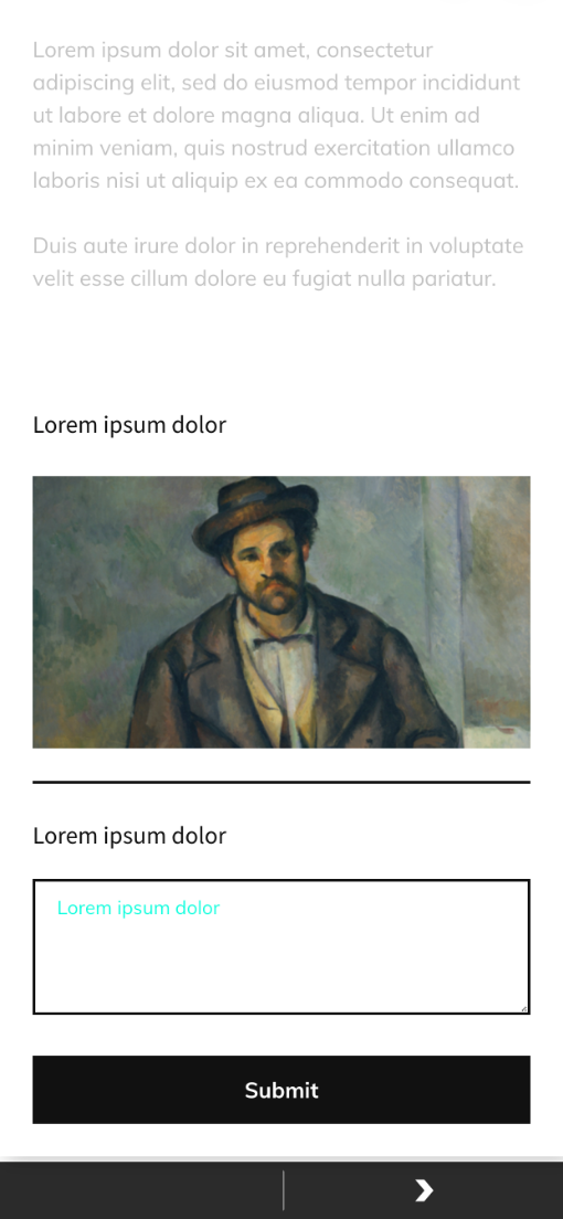
Multi-Line input
Allows gathering long text data.
Component Label
Here you can add the component title. The title displays only on the component card in the CMS to differentiate one component from another.
Display Label
Add and style labels that will be displayed in this component in the app.

Required
Check the box if you want to make submission of this component mandatory for Submitting the form in the app. That is if the option is set app user will not be able to submit the whole form without selecting an option in this section.
Multi-line Input text styling
Users' input will be of the same style as set in this field.
Multi-line Input rounded corners
Set the radius of corners in the Multi-line Input field.

Multi-line Input background-color
Set the background color of the Multi-line Input field.

Multi-line Input stroke color
Set the color of the Multi-line Input field border.

Form Options
Here you can set the general style for the whole form builder.
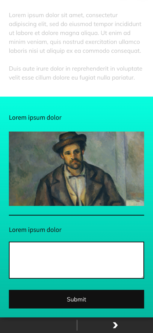
Module background-color
Here you can set the background color of the module.

Module background gradient
Here you can set the background gradient of the module.
Module padding
Set the distance between module content and its edges.

Component spacing
Set the value will define default space between components in the module.

Button text
Add and style text that will display on the Form Builder submitting button.
Background color
Set the background color of the Submitting button.

Rounded corners
Set the radius of corners of the Submitting button.

Stroke
Set the color of the Submitting button border.

Paddings
Set the paddings inside the Submitting button.
Align
Align the button inside the form builder. You can align it either to the center, right or left side.

Width
Set the width of the Submitting button.

To build a Form Builder Module
NOTE: while building the form you can preview it by clicking the Preview Form button.
-
Scroll down to the Stop Form builder section on the Stop Detail page.
-
Click the + plus button on the Form Builder card to start to build your form.
-
Click on a component from the list to add it to your form. Above you can find the description of the components and their settings.
-
Click + plus button under the just added component to add another one.
-
repeat till all the components are chosen, but note that there is no need to add all the components at once.
-
hoover the mouse over the component and click the
 button to delete the component.
 -
it also possible to copy components by clicking
 button.
-
-
Now you can rearrange the order of your components: simply click on the component and start moving it there where necessary.
-
note: the components will display in the app in the same order they are in the CMS.
-
-
Click the component to start adding content and style it.
-
Don't forget to save the changes made to the component by clicking the save
 button in the right upper corner of each component.
-
to close the component click
 button.
 -
to reset all the changes click
 button.
-
-
As soon as all the modules are ready style the Form in the Form Options tab.
-
Add a title to the Form in the Form Name filed before saving.
-
Click Save Form as soon as you finish with Form creation.
-
note: it is not necessary to click Submit button in case you have already saved the form. The only time user should Submit changes is when switching on/off the Enable form on stop setting. Besides if the user is editing the form same logic is applied, once the user is done editing saving the changes by clicking the Save Form saves the changes without the need of clicking Submit button to save the page.
-
note: this submitting logic is only applied to the Form Builder, all the other changes made on Stop Page should be saved by clicking Submit button.
-
-
To enable the form in the app turn on the Enable form on stop button on the Form Manager card.
-
here you can also Preview, Edit, and Delete existing Forms by clicking corresponding buttons.
-
You can download gathered users' data by clicking Download CSV Results on your form tab on the Form Manager card.