The Application Scaling functions allows users to scale an app with respect to the device screen resolution it's going to be displayed at.
This is a setting that allows you to optimize for very large screen resolutions.
Let's say you are designing an app for a 4K screen resolution - you will need to turn on the scaling feature in the CMS for our apps to render with appropriate UI size for that resolution. In the CMS we have implemented predefined scaling sizes that will work on the majority of devices but you can tweak those if you are creating a device specific application to achieve the perfect amount of scaling.
In case of devices with extreme physical size difference and same resolution (lets use 14" 4k laptop screen and 83" 4k large format display as examples) as we can't detect physical sizes of displays there is a chance scaling might not look perfect on ends of size spectrum (i.e. if a scaling factor is set to 4 - app UI might look a little bit too big on the 14" 4K laptop screen while it looks a little bit too small on the 83" 4K large format display).
In this case we recommend to determine the primary device for the app and optimize for that (i.e. deciding that majority of the users will use a laptop screen and not a large format display).
Card settings
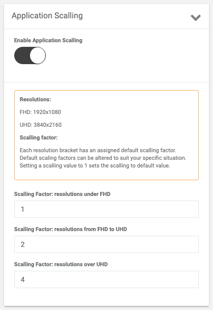
Enable Application Scaling
Scaling Factor: resolutions under FHD
If your app is open on the screen with this resolution then default scaling of all the elements will be multiplied to the value set in this field.
Scaling Factor: resolutions from FHD to UHD
The default size of the elements in your app will be multiplied to the value set in the field in cases where the app is opened on a device with such resolution.
Scaling Factor: resolutions over UHD
All the elements in the app will be zoomed by the value set in the field in relation to their initial/default size if the app is opened on a device with the resolution over UHD.
To set the Application Scaling on your device:
1. Navigate to the App Customization page in the left nav bar --> Application Scaling card.
2. Turn on the Enable Application Scaling control.
Tip: each resolution bracket has an assigned default scaling factor. Yet, the default scaling factors can be altered to suit your specific device. For this:
3. Set the scaling value in one of the three fields, depending on the screen resolution of the device the app will be displayed on:
Set the scaling value to the Scaling Factor: resolutions under FHD field if your device has a resolution under Full HD (screen width under the 1920px).
Set the scaling value to the Scaling Factor: resolutions from FHD to UHD (Ultra-height definition resolution) field if your device has a resolution from Full HD to Under Full HD (screen width over the 1920px and under the 3840px).
And set the scaling value to the Scaling Factor: resolutions over UHD field if your device has a resolution over UHD (screen width over the 3840px).
4. Click Submit to save the changes.
Now all the app elements will be scaled in relation to the value set in the field which corresponds to the resolution of your device.
Example: let's say, your device resolution is under FHD and you set the 4 to the correspondent field in the CMS thus all the elements in the app will be zoomed by 4 times in relation to their initial size.
If the app is going to be used on several devices set the resolution value to correspondent fields so the program could automatically apply necessary scaling depending on the device screen resolution the app will be displayed on.
Tip: setting a scaling value to 1 sets it to the default value.